Design Process
Research
Through my research while writing my proposal, I found that many people avoid sending physical cards because of the hassle, buying a card, finding an envelope and stamp, and making a trip to the mailbox. With online communication being so much more convenient, it's often the default. I also noticed that most greeting cards are tied to specific holidays or occasions, with very few made just to brighten someone’s day for no reason at all.
Through article researched mainly based off COVID-19 pandemic and the connection which letters createI was inspired to create Little Letters, a card line focused entirely on sharing everyday joy, simply and thoughtfully.
As part of my research, I also tested the concept of everyday cards by having three people try it out with me. We each wrote and mailed a card, then reflected on how it felt to send something so simple and thoughtful. A few days later, we all received unprompted messages from the people we’d sent them to, saying how happy they were to find a letter waiting in the mailbox. These genuine reactions helped confirm that a small, everyday card really can spark joy and connection in a meaningful way.
Resources
Small greeting card businesses became a key source of research throughout this project. Unlike larger companies like Hallmark, which tend to stick to more traditional designs, these smaller brands often showcased more creative and unconventional approaches to card-making. They also played an important role in guiding my website prototype serving as competitor analysis that helped inform the content and structure of the affinity diagram I created later in the semester.
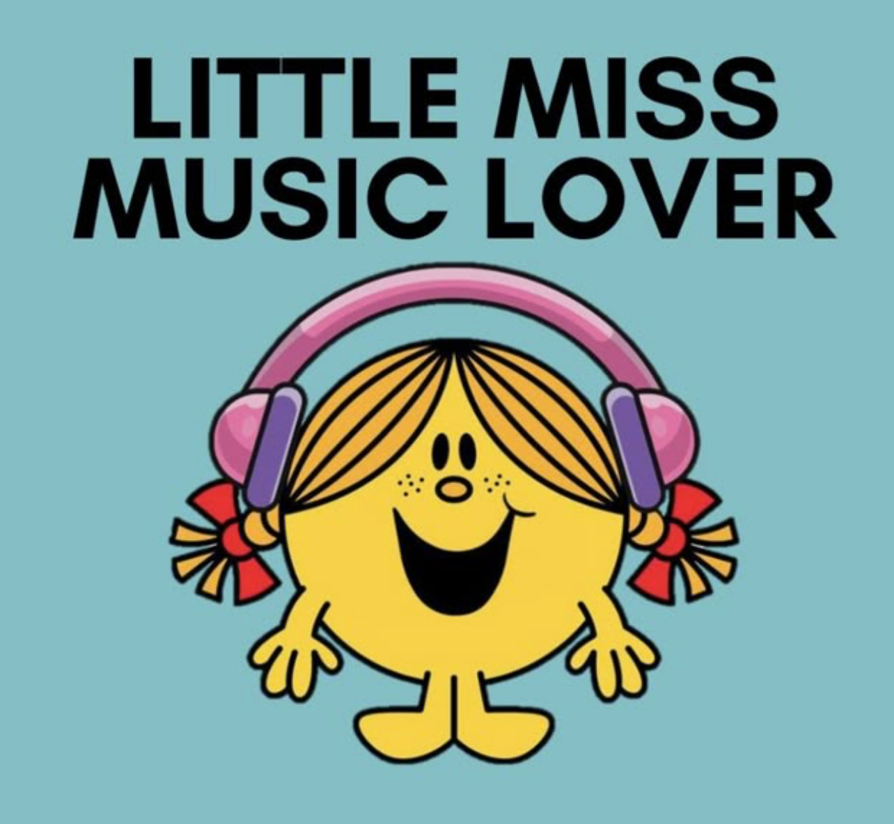
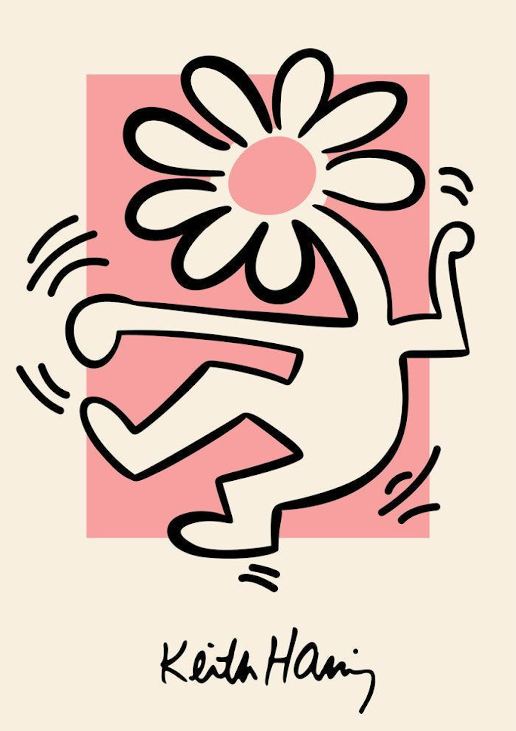
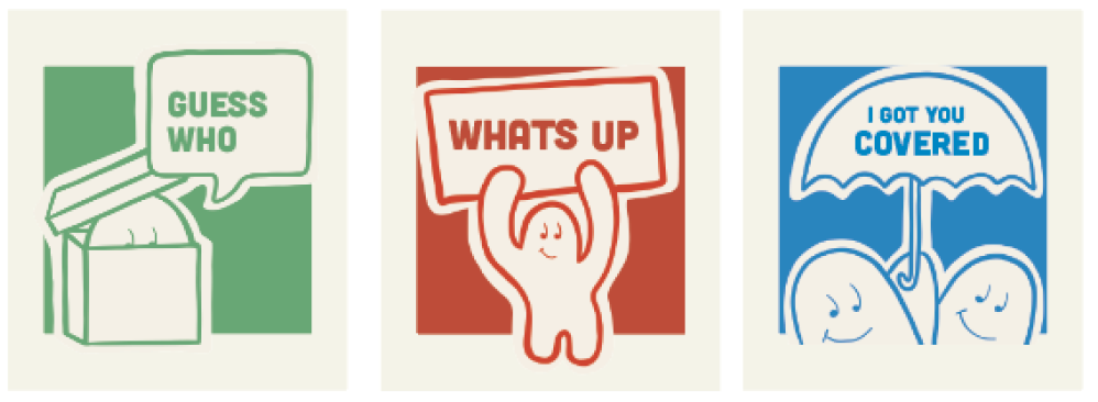
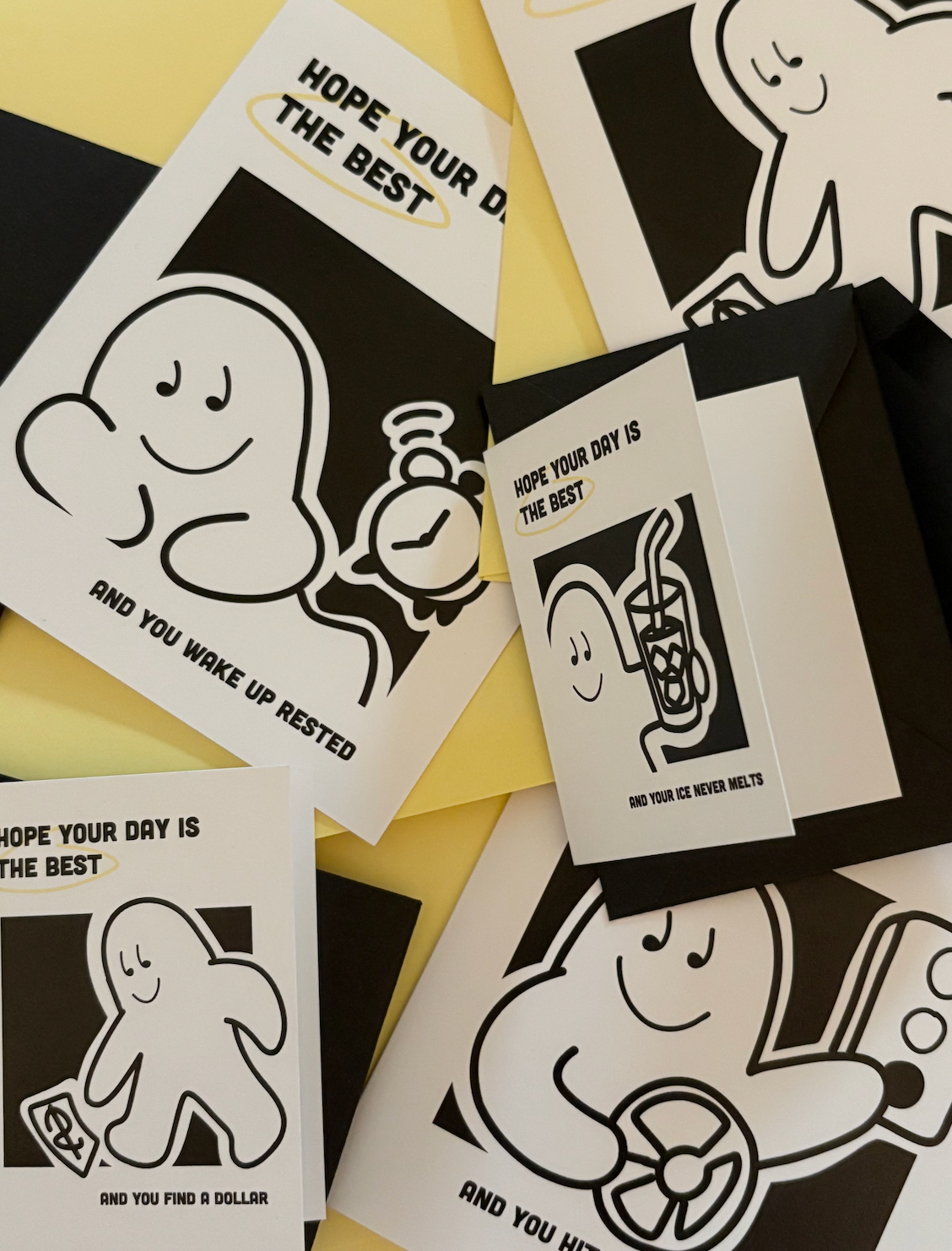
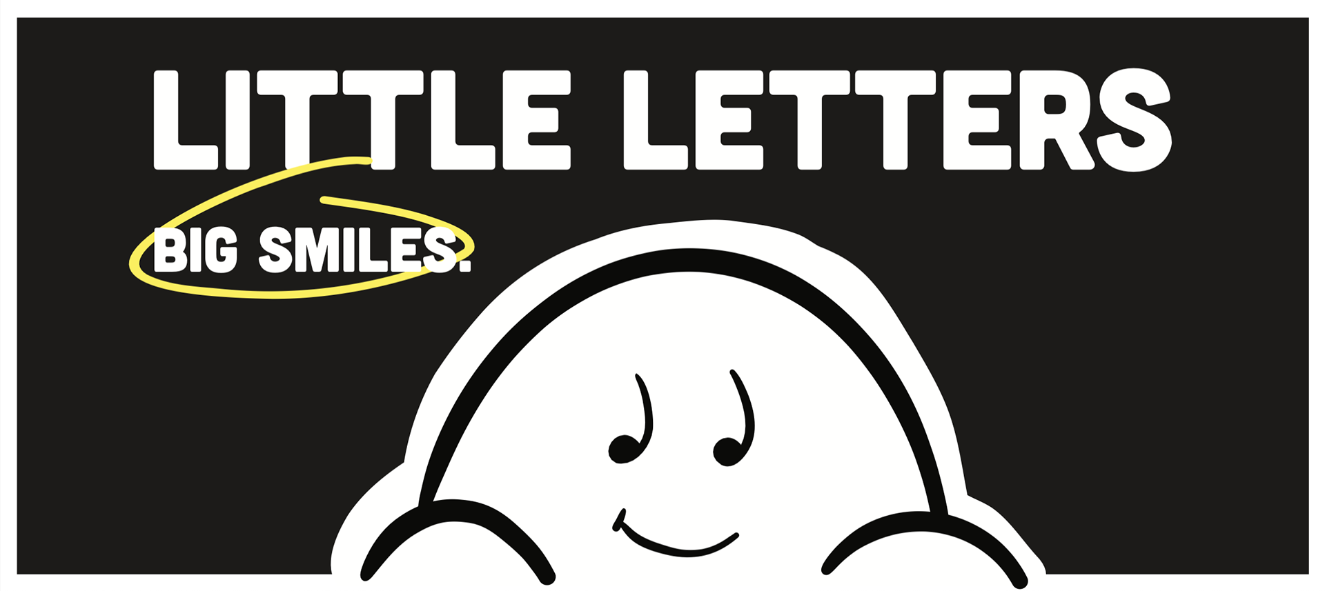
After choosing Keith Haring as a key design influence, I began researching other artists known for creating simple yet iconic characters like Bert and John Jacobs, the creators of Life is Good, and Roger Hargreaves, known for Little Miss. Each of these designers developed a recognizable character that became central to their brand identity. I drew from the visual simplicity of Keith Haring and Life is Good, as well as the personality-driven approach of the Little Miss series, where each character represents a specific trait or mood. Inspired by these examples, I created Little Letters, featuring a minimalist cartoon character experiencing some of life’s everyday little joys.
Feedback
Most of the feedback I received for this project came from Professors Woojin Lee and Amy Papaelias, as well as my classmates and friends. I especially leaned on my non-design friends throughout the process because I wanted input from the kinds of people who might actually buy these cards in a store. Their feedback was really valuable—often more conceptual than design-focused which is something we don’t always get in class.
Professor Papaelias introduced me to some inspiring card designers that helped shape my visual approach, while Professor Lee encouraged me to think beyond the page. She pushed me to explore the idea of an art installation, which ultimately helped address one of the main problems I was trying to solve with this project.
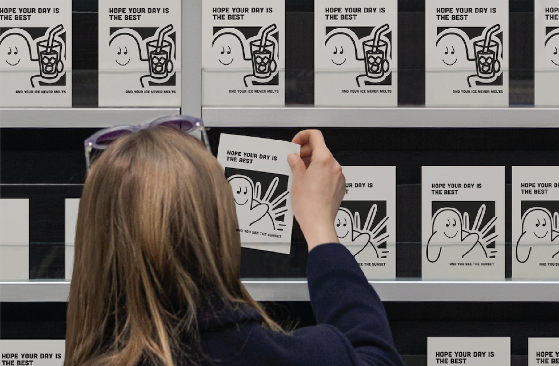
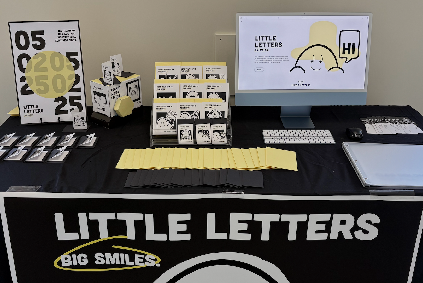
Installation Process
Final Installation
Obstacles
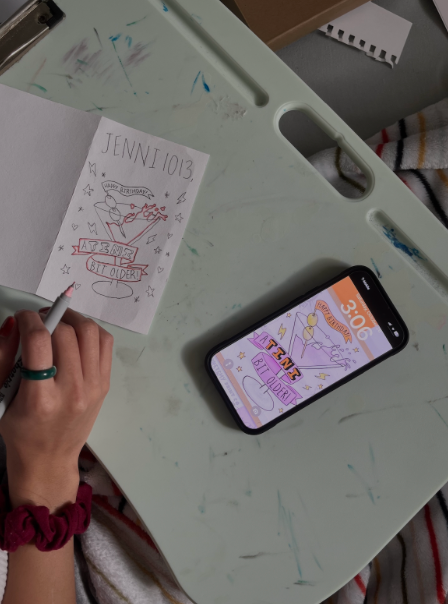
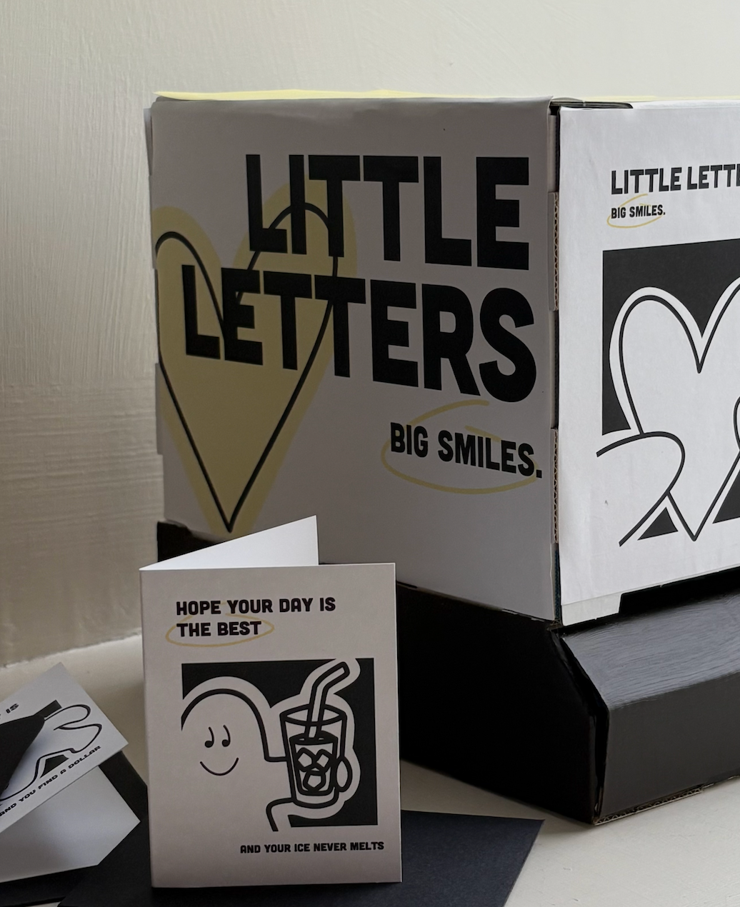
Obstacles were the one constant throughout this entire process. One of the first major challenges I faced was trying to hand-print my designs. Although I had created wooden stamps and had access to ink and a press, the prints were losing the boldness that I loved in my original digital work. This became the first of many tough decisions I ultimately chose to print the cards digitally instead. While this wasn’t my original plan, switching to digital printing opened up more flexibility with color. I started experimenting by removing black and designing only with color to maintain a simple two-color palette, but the results felt less bold and impactful. In the end, I returned to a mostly black-and-white design with just a touch of the yellow accent I had liked earlier in the process—striking a balance that kept the cards clean, simple, and bold.
Obstacles were the one constant throughout this entire process. One of the first major challenges I faced was trying to hand-print my designs. Although I had created wooden stamps and had access to ink and a press, the prints were losing the boldness that I loved in my original digital work. This became the first of many tough decisions I ultimately chose to print the cards digitally instead. While this wasn’t my original plan, switching to digital printing opened up more flexibility with color. I started experimenting by removing black and designing only with color to maintain a simple two-color palette, but the results felt less bold and impactful. In the end, I returned to a mostly black-and-white design with just a touch of the yellow accent I had liked earlier in the process—striking a balance that kept the cards clean, simple, and bold.
Reflections
Looking back on my project as a whole, I tried a lot of things—some that worked and some that didn’t—but in the end, I’m proud of what I created. I'm glad I explored hand printing, even though it didn’t make it into the final version. I do wish I had asked for help with the vending machine earlier; it would’ve saved me a lot of stress and given me more time to focus on developing the website. That said, I’m excited to keep working on Little Letters and hope to launch a fully functioning site by the end of this summer where the cards can be sold.
Throughout this process, I learned a lot—both as a designer and a student. I realized I tend to second-guess myself more than I should, and that simply talking things through, whether with a designer or not, can be incredibly helpful when I start to overthink. I also learned how much working around other creative minds can fuel your own ideas. The midterm reviews we did with our classmates were especially eye-opening—getting to hear different perspectives and approaches helped me think about my own project in new ways
Final Project Presentation